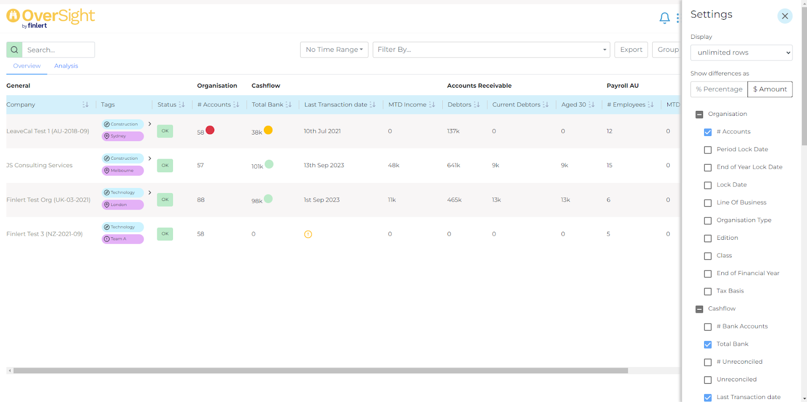
Overview Dashboard
The ‘Overview’ provides a snapshot of the data that is taken each day.
This will build up over time and allow you to do data comparisons using the time range filter at the top.

The nature of the metrics available in the ‘Overview’ also lend themselves to snapshot data. As an example the number accounts in the Xero chart is a calculated metric that we can snapshot every day.
Should a threshold be established for any of the Overview metrics, the appropriate coloured circle will appear next to that metric whenever this view is reviewed.

